Blog
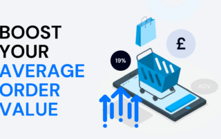
The 19% boost in Average Order Value that could transform your business
In the world of ecommerce, where revenue growth is paramount, increasing Average Order Value (AOV) stands as a pivotal strategy for businesses. It's a method that can significantly boost revenue without the need to acquire new customers. Traditional methods such as upselling, cross-selling, and loyalty programs have long been championed as effective means to ...

How to dramatically increase high-value behaviours on your website
Delivering an exceptional website experience is crucial in today's dynamic digital commerce landscape. Your website serves as the digital storefront where users engage with your brand, products, and services. Every interaction, from clicks to scrolls, influences user perceptions and behaviours. Let's explore how you can enhance high-value behaviours on your website, drawing insights from ...
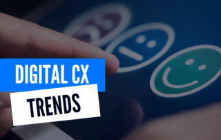
6 digital Customer Experience trends you need to know about
This isn't just another rundown of trendy design elements or UX features; it's an exploration of the paradigm shifts transforming the digital realm. As online behaviours evolve, so must our approach to crafting user experiences across various digital platforms. In today's dynamic digital landscape, understanding and adapting to emerging trends in digital Customer Experience ...

Why you should never leave UAT to the dev team
In today's world of digital experiences, the success of your websites and applications hinges on more than just sleek design and snappy functionality - it's all about crafting exceptional digital customer experiences. Enter User Acceptance Testing (UAT), the crucial last step in the development process that ensures your digital offerings not only work but ...

10 actions you can take if you see a drop in your conversion rate
Reviving your conversion rate: A 10-step guide In the world of ecommerce, your conversion rate is more than just a metric – it's the pulse of your digital success. It measures how effectively you turn curious visitors into committed customers. But what do you do when that pivotal metric takes an unexpected nosedive? In this ...

Website Wars: PrettyLittleThing vs Missguided vs ASOS vs Boohoo
2024 looks set to be a turbulent year as we enter into a recession in the UK. For many e-commerce sites, this can be a daunting time, but luckily for you, we have our free 7 ways e-commerce sites can beat the recession ebook to help guide you through. In 2023 we saw the ...
